Project
Logo, Website Design and other projects for Little People's Play Cafe
I was asked to create a new logo for a play cafe that had to reflect the fun that the children would experience at the play cafe. I used an childlike illustration concept to create the logo that contains children playing with a bright colour scheme and drawn elements to add to the child theme. The client also wanted to have a new website that continued the fun theme and style but was also informative for the parents.
Logo design for Little People's Play Cafe
As always I presented a few ideas to the client and then made changes until we arrived at the chosen logo. The logo is fun with bright colours to match the childlike drawing effect.
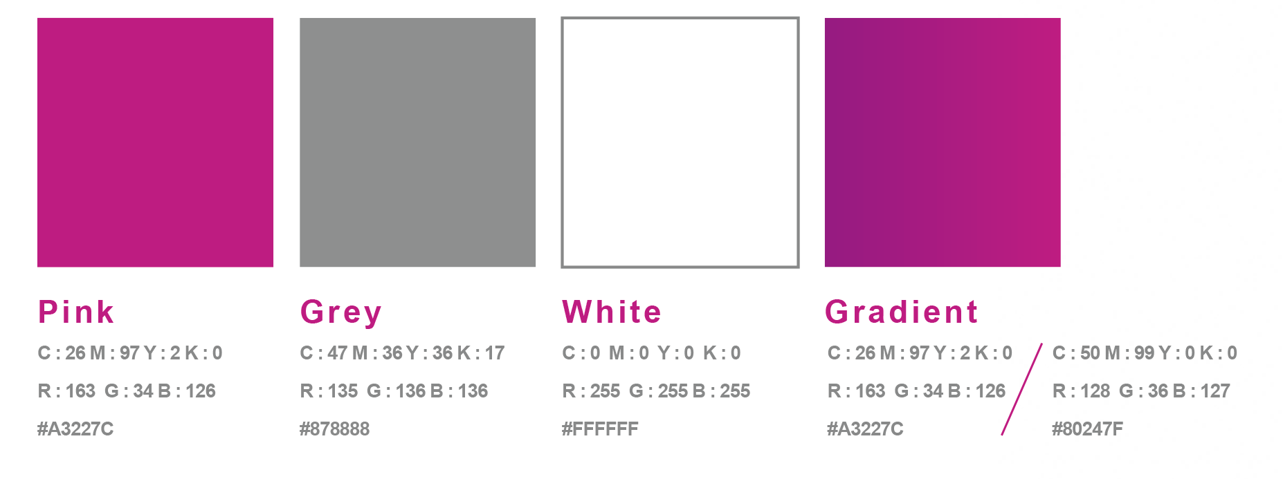
The brand colours The colours are bright including yellow, blue, green and pink.
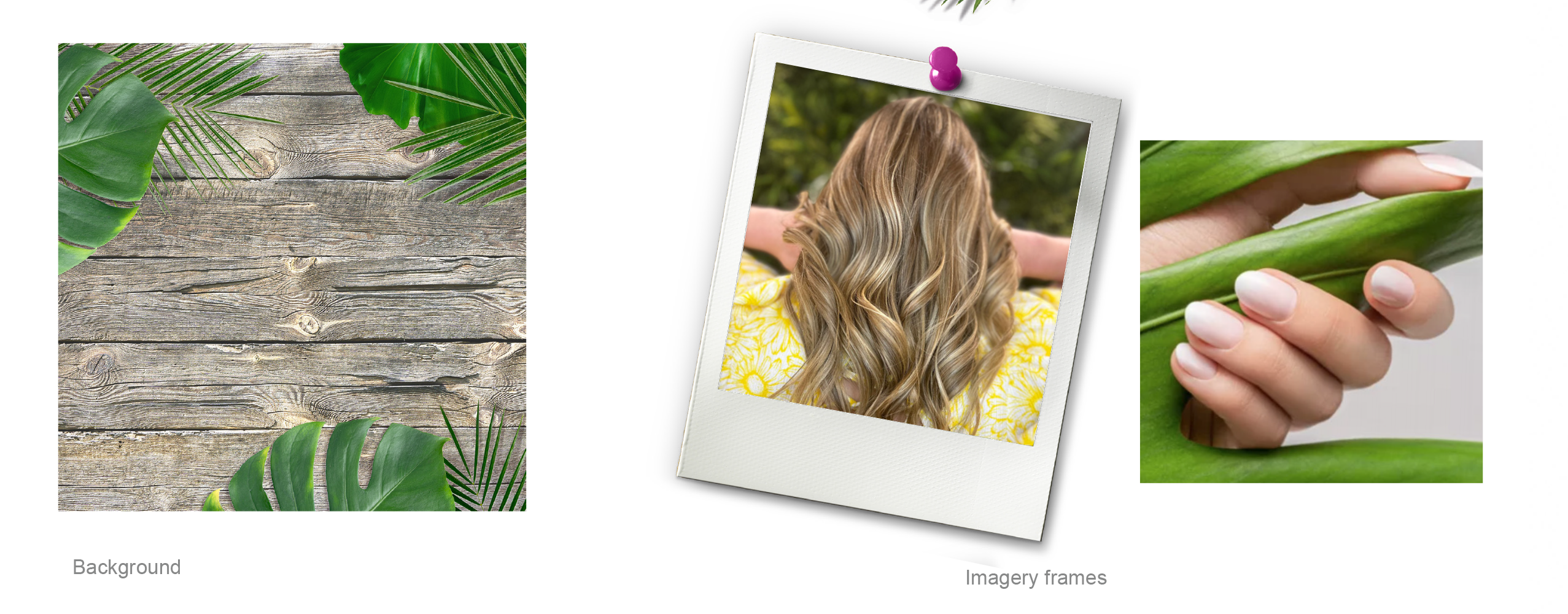
Imagery should be bright colourful images with chunky borders in the colour scheme.
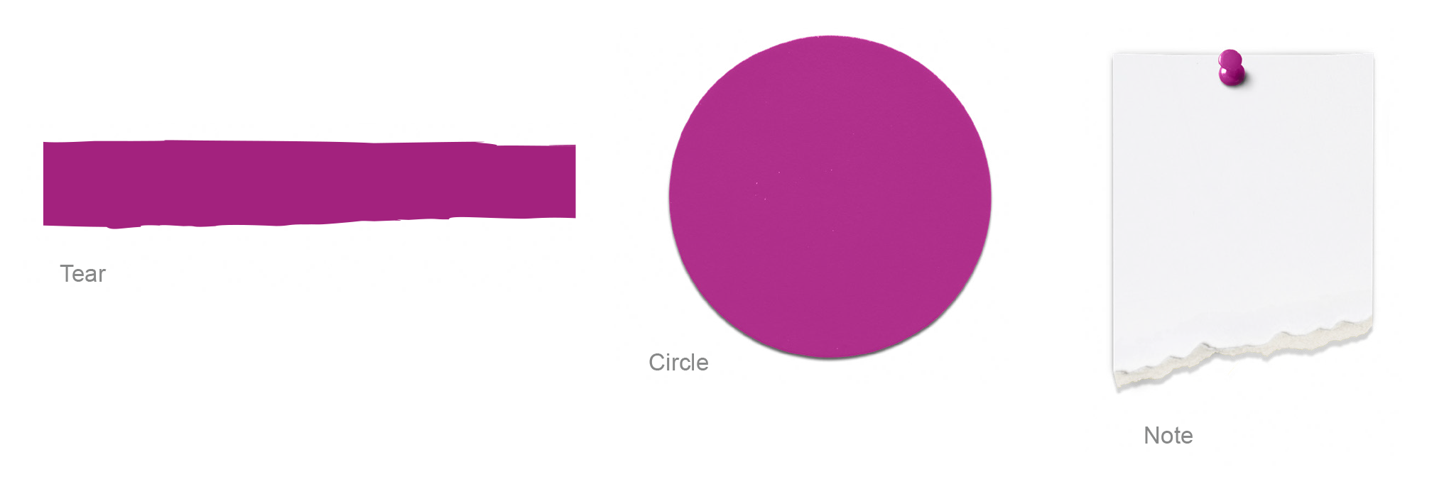
Elements include the paint sections that should be used to separate sections and scribbled block for titles and buttons. The drawn doodles are used to decorate the graphics. The children characters drawings are used to highlight the different activities. click here
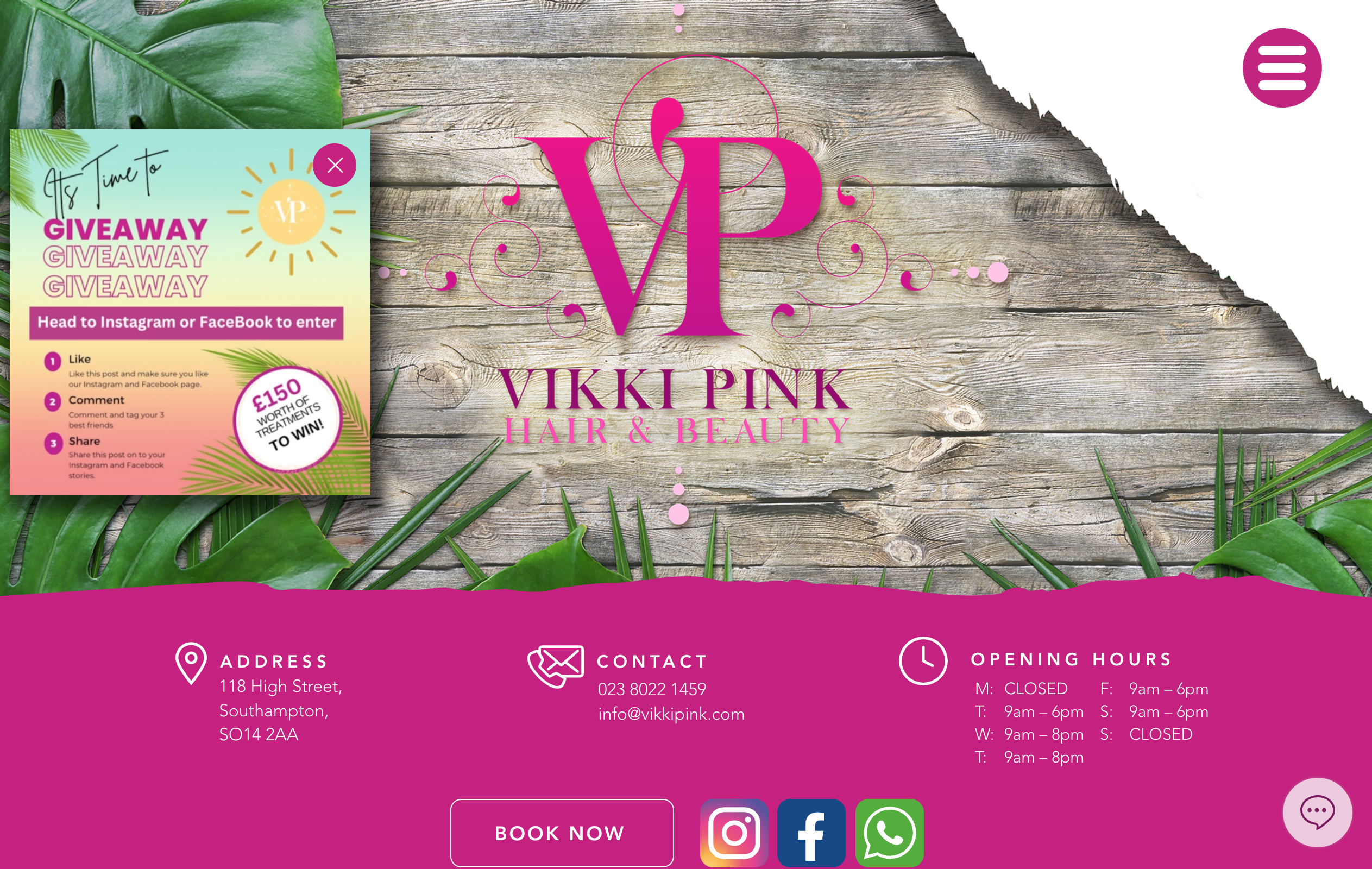
Little People's Play Cafe needed a multipage website with links to their booking page.
Website
The website was a multipage website set up to keep to the above branding styles so fonts and colours and the imagery thoughout the site were in line with the style. The site was designed in Wix so the client could have access to the site and make minor changes themselves with all major changes being done by Harper Design Studio, with Nicky Harper being the Web Designer and Manager.
Visit the site at www.littlepeoplesplaycafe.co.uk
Other Projects
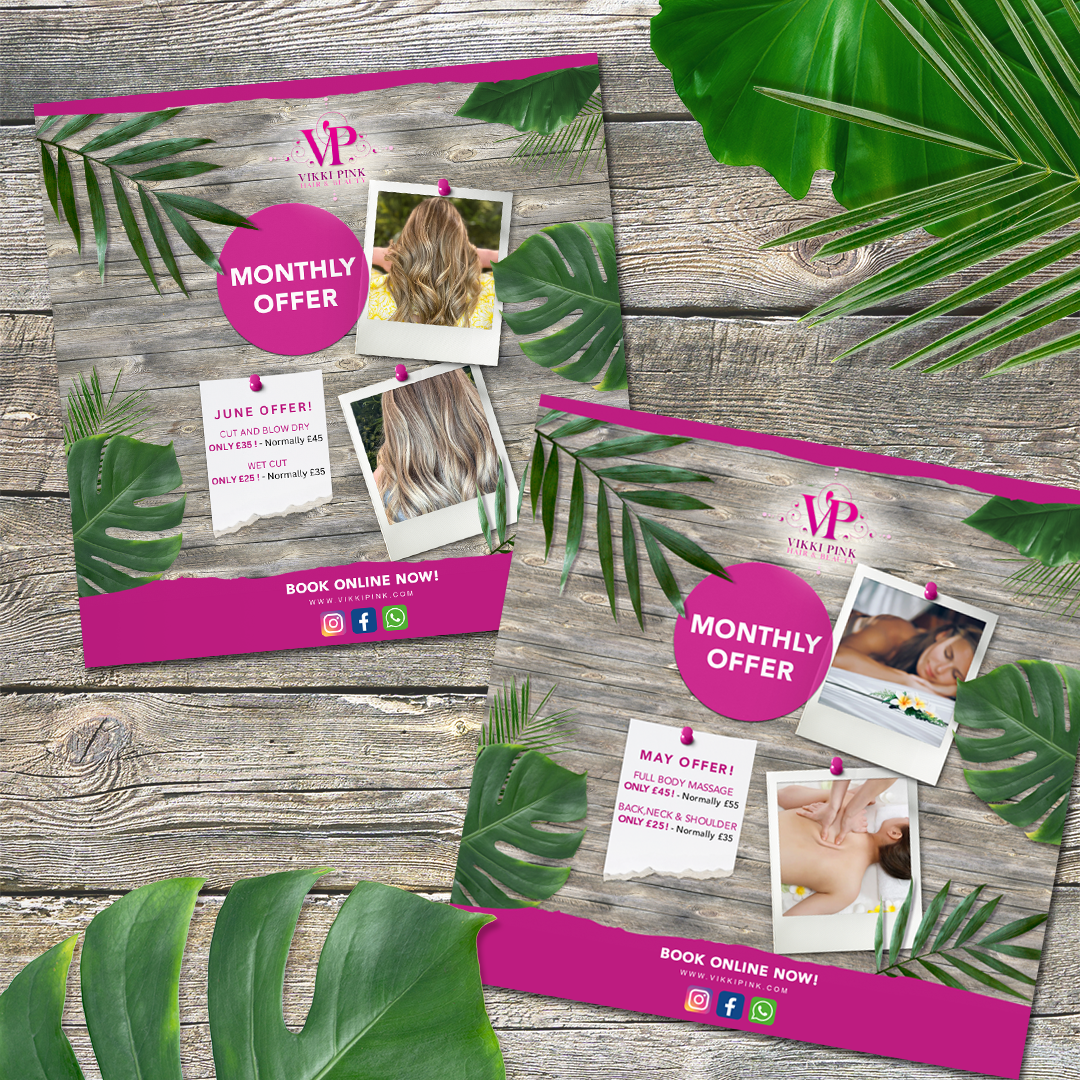
Flyers
A4 Flyers
Posters
A5 Posters
Social Media Adverts
Set of Social Media Adverts